But, in order to share the "After" with you, I have to share the "Before."
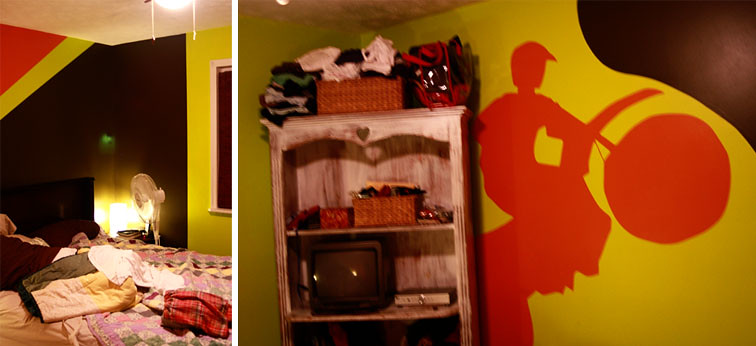 When we moved into our house, the room we picked for our master bedroom was previously a young boy's room. It's hard to believe that our bedroom used to have a motorcycle painted on the wall.
Now...take a look at the "After." (You may recognize many of the items from our bedroom in our apartment, but it's always nice to take familiar items and set them up in new ways.)
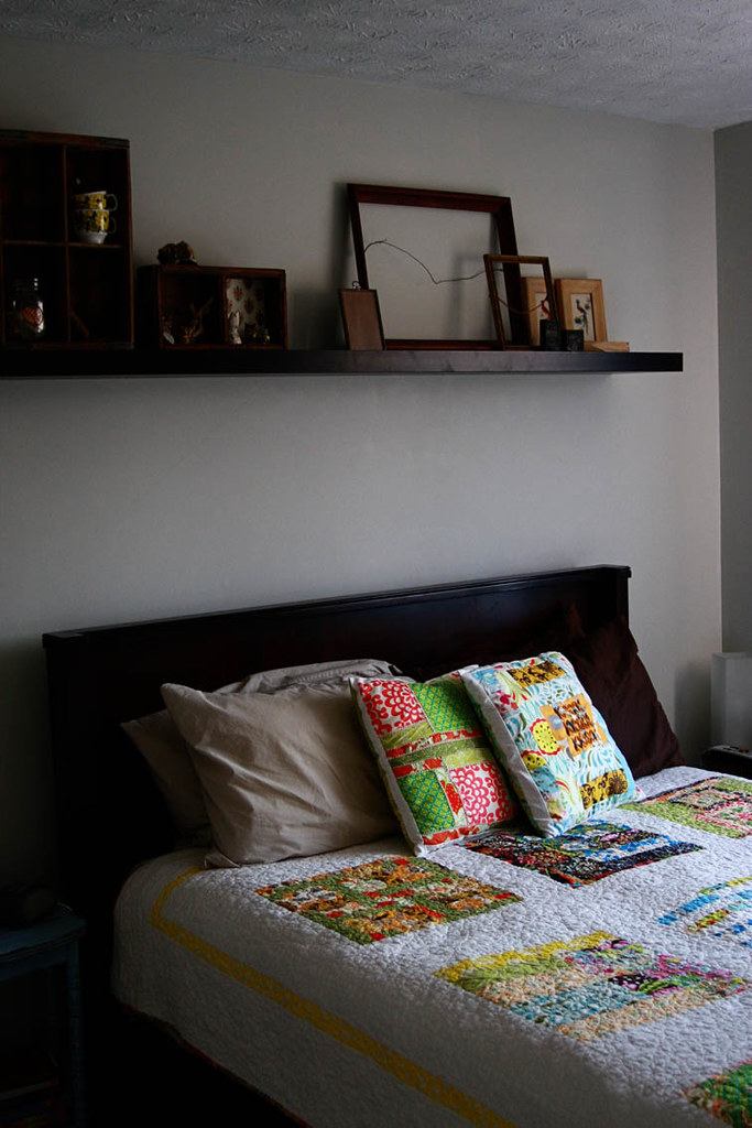
 The whole goal of our bedroom is to be a breath of fresh air when you walk in. The walls are a light gray and many of the details and knick-knacks and are natural and neutral in their color scheme. These subtleties allow the quilt, made by the quilting bee I'm in (A Notion or Two), to be the focal point of the room. The bright colors and white sashing of the quilt add a big blast of contrast that pops without being too overbearing. I also used the same yellow fabric in the border of the quilt as the curtains on our dresser, allowing the textiles in the room to sing and shine.
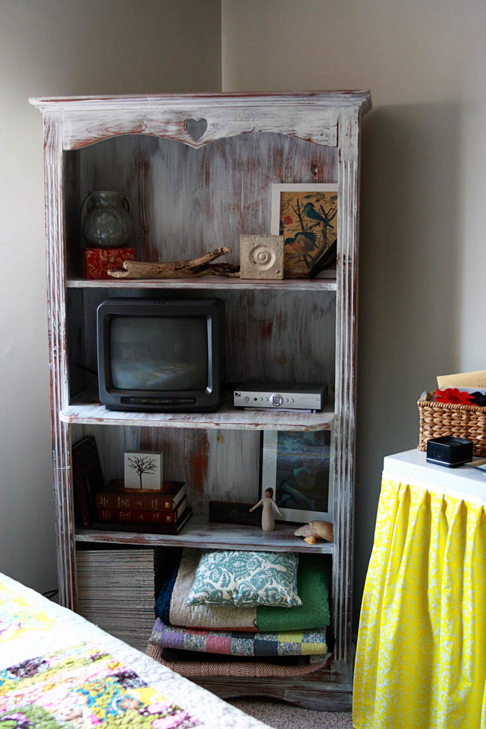 This bookshelf was built by my Dad when I was a little girl. It has been a part of my bedroom ever since. And even now, as a married woman, I'm able to enjoy it's beauty in our bedroom.
 Quilts and blankets made by the women in my family (including me); shells from the Outer Banks, NC; my Hubby's favorite Picasso painting.
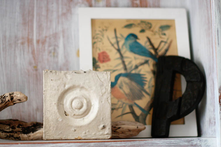 Drift wood from Outer Banks, NC; letter "P" from Anthropologie; bird print found at a yard sale; porch block from old Victorian house found at an antique shop.
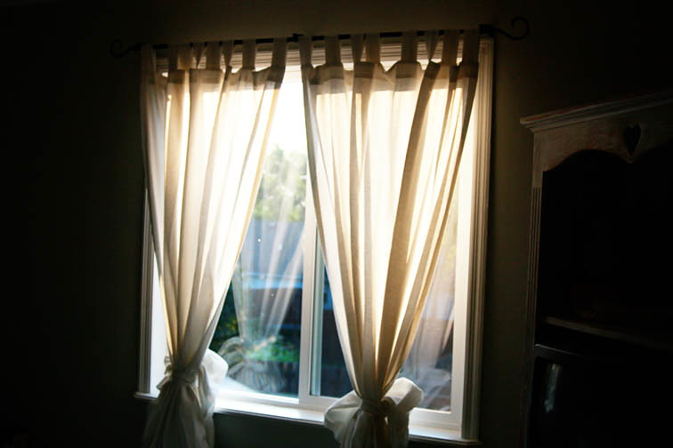 Beautiful linen curtains from IKEA. They are too long for our bedroom and would get really dirty from our pets if they hung to the floor. So instead of hemming them, I pulled the bottoms up and tied them with the sashes that were included. It adds to the texture of the curtains and makes them fuller.
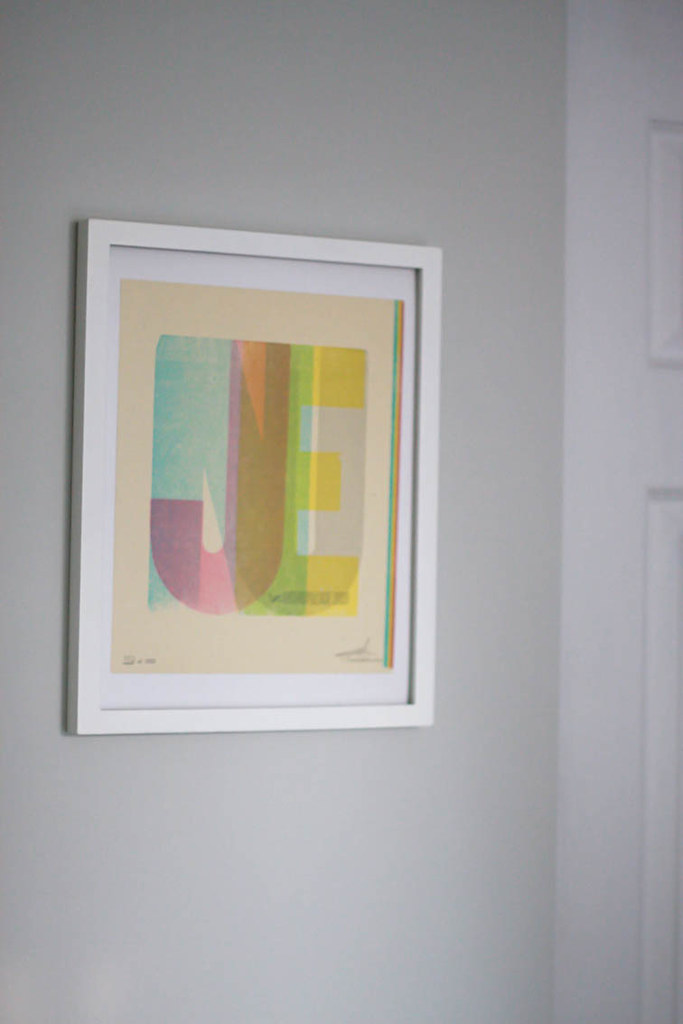 This is a limited edition print from Hatch Show Print. It was used as the cover design for the June 2009 Anthropologie catalog. I was excited when the opportunity arose for me to buy this limited edition print because it combines 2 of my favorite creative inspirations...Anthropologie and Hatch Show Print. June is also the month that my Hubby and I were married so that makes the print that much more special.
 I've never been much of a jewelry box kinda girl (something I picked up from my Mom). So instead, I love to display my jewelry on random objects. Not only does it add pizzazz to my outfits, it also becomes decor when I'm not wearing it.
 Shells on our dresser from the Florida Coast; shells in a jar from the Outer Banks, NC.
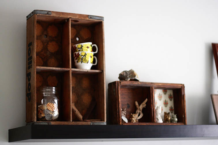
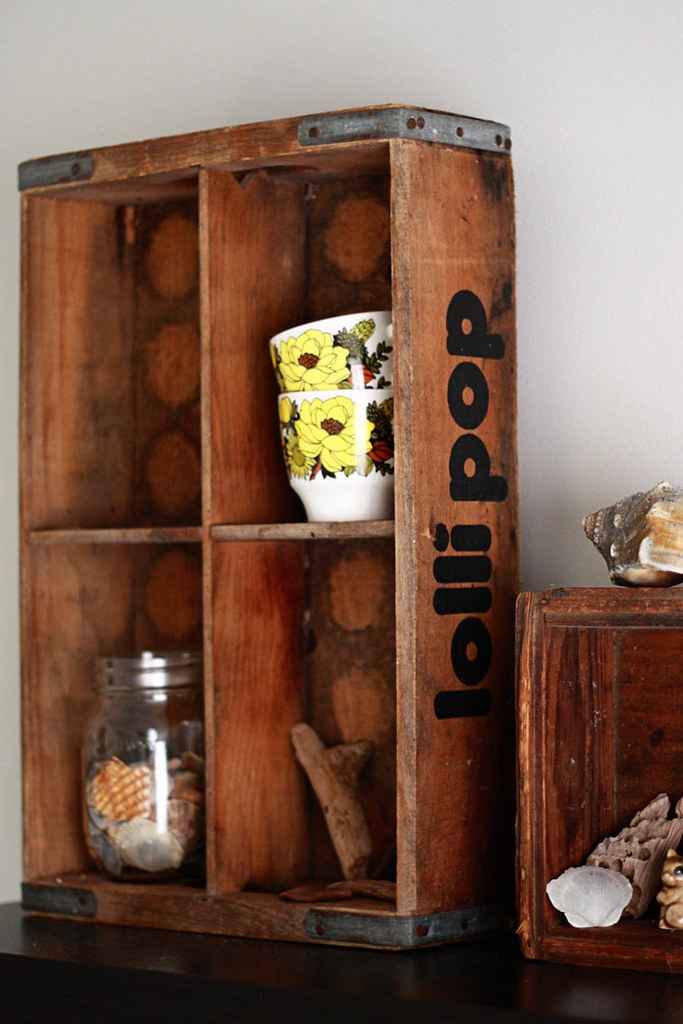 The Hubby and I fell in love with crates and old boxes last summer when we discovered the book Recycled Home. They make such great displays for knick-knacks and the like. They also add a rugged texture to the soft gray walls and the sleek IKEA shelf over our bed.
 Last summer I went a bit crazy with buying little knick-knacks from yard sales. I've found everything from old rubber stamps to little porcelain animals. I've also incorporated shells from the Outer Banks and little pieces of driftwood. They add that perfect organic touch to the displays.
 People often ask why we have so many empty frames around the house. Well...isn't it obvious? They're so cool and add a lot to a room. I love showcasing the textures of different frames and showing their antique hanging kits that are still intact.
I hope you've enjoyed this tour of our oh-so-refreshing bedroom. I know we do!


2 comments:
beautiful! Love the bookshelf!
It's wonderful!!!!!!!!!!
Love the beach items!!!!
Love, Mumma:)
Post a Comment