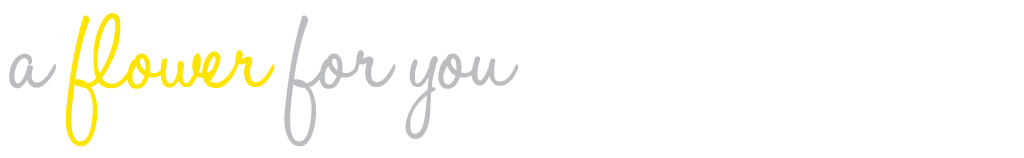
Ok...so, those of you who follow my blog know that I have my own freelance graphic design firm called Revel Design. Well that's all good and fun for freelance jobs, but when it comes to actually applying for a job and sending my resume and portfolio to potential employers, I couldn't very well send a package with the name of a design firm on it. It just wouldn't make any sense. So I have come up with a personal logo for myself. And here it is...
I'm pretty excited about it because I feel like it really reflects who I am as a designer. I used bits and pieces of one of my paintings to create the logo because I want to portray that when I create, I use all forms of art to inspire me.
Let me know what you think. I'd love to have some feedback!


12 comments:
I love it! It reminds me of a flower blooming and a bird ready to spread her wings!!!
Love, Mumma;)
I really, really like it. Clean and fresh. Sophisticated. Smart.
I love it!
New to your blog. Love your logo though. Very cute.
Looks great Sarah! I like the bit of your painting in there and the color palette is very smart.
I really like it too. I love how it looks like swatches of fabric stitched on there.
I love it! Very clean and simple, yet a bit of artistic flare... LOVE IT!
This logo definitely represents you. Its airy and fresh and fun. When I first looked at it I thought the petals were made of fabric which is something you really enjoy. I love it. It is you. You have to post the whole design suite when its done :-)
Miss you!
I think its cute, I like the font and the colors!
I love it - I agree with everyone - very fresh (and cute!)
I think its absolutely fantastic, sarah!
-kristin :)
I love it. Good simple and clean fonts.
Love it. I am loving the lockup with h, p and d in your name-it works perfectly. The colors are great. It's stylish, simple and unique. Now move back to Chicago and come work at CHANGEffect with me!
Post a Comment